
I have been planning to paint our front door since we moved in. It was a burgundy/purple shade with brass numbers, brass kick plate, and brass handleset. The gray trim and shutters combined with the dark door made a dreary and uninviting entry to our home.

Granted, this photo was shot on a cloudy day, but even in sunny weather, I don't think the exterior represents us very well. It doesn't exactly say, "Fun people live here!" It kind of says, "Enter at your own risk! Mwahahahahah!" In fact, I kind of get the feeling the house frowns at me with the way the roof line falls. Poor sad house.
We decided to go with a sunny yellow on the door. I think it plays nicely with the brick and the grays of the trim and shutters and gives a much happier feel to the house. Also, it will hopefully look nice with nearly all of my wreaths. Because, you know, that's important.

Initially, I was thinking about different hues of green, blue, orange, and yellow. I got LOTS of samples of each color and taped them to the house. We decided that:
- blue was out because the living room and sunroom {visible as soon as you enter} are blue and it was a bit of blue overload.
- greens were out because they blended in too much with the foliage.
-oranges were out because they didn't mesh as well and we're not Vols fans. Shhh. Don't tell any of my Knoxville friends I said that. Besides, I wanted something that would feel energetic and happy all year round, and the oranges I liked were too fallish.
So we were left with yellows. I found out something through this project. After filling in all of the screw holes from the kick plate, brass numbers, and old handle set, sanding it down, priming it twice, refilling places I couldn't see before, sanding it down again, priming again, and then doing four coats of yellow, I still wasn't satisfied with the coverage. I later learned that yellow has less pigment than other colors, a fact which surprised me because it is such a saturated color. Apparently that doesn't matter. In fact, red is also a color with little pigment, which explains why I have had to use up to seven coats to be satisfied with the coverage when I've painted a wall red. And {sheepishly}, yes, I am neurotic enough to do all seven coats. Notice that we have no red walls in this house. Or in our last house. There's a reason for that.

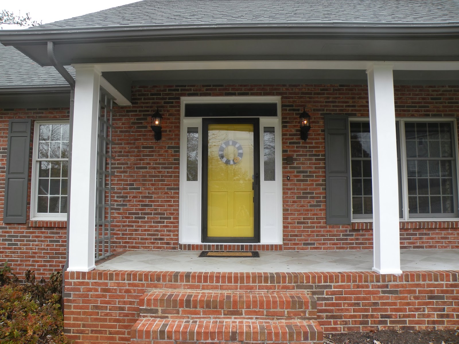
Back to the house. I knew from the beginning that by choosing yellow, I would have to paint the sidelights. You can see in the picture above that it looks very odd and loud with everything else being so muted. The windows around the house are white, so painting the sidelights white {instead of gray} should blend.

Instant facelift! Doesn't it have more presence?
But now everything else was looking dingy and off balance.

What about the garage door trim? Painting that white might balance the door a bit.

Kind of hard to see, so:

It's a little more obvious in person, but not in an in-your-face kind of way. It definitely gave more symmetry to the house.
We started thinking at this point about the columns. Actually, I'd been thinking about them from the beginning, but didn't want to jump into painting them if they looked better gray. We have to replace at least one of them at some point soon {it's pretty chewed up},

and are thinking through our options there, but it wasn't too much trouble to paint them white in the meantime.


There is one area I haven't finished because I can't reach it. See behind the rain spout? It's blocked by the trellis. I plan on fixing it, but I need an extention ladder to reach it, and frankly, you can't see it from most vantage points, so I'm not too concerned about getting it done before next spring. To get this shot I'm standing in the flower bed and holding the camera up over my head.

From farther away you can't really tell at all. I'm still in the yard for this shot.

And here's what started it all. The yellow door. I love the yellow we chose {at first I was scared because it is awfully bright, but with all the bright white trim, I love it even more}. It's called Decisive Yellow by Sherwin Williams, color matched to a Behr outdoor paint by Home Depot.

I decided not to replace the kick plate {that metal rectangle on the bottom of some entry doors}. The brass one that had been there had not a scratch on it, so I felt pretty comfortable that the door itself wouldn't get dinged up enough to need one. If for some reason it does, we can always add one later.
I made a yarn wreath and stuck a felt brooch in it for the fall. I'll reuse the wreath with other decorations throughout the winter. Can't you see snowflakes or something?

And here's my beautiful new hardware. When we moved in, we had to replace all of the doorknobs in the house. The insides of the existing ones were plastic and many had broken. The kids {and I} kept locking ourselves in or out of rooms! Thankfully, we found brand new doorknobs at a local salvage yard for a mere $5 a piece. Phew! That's about 80% off, for those of you who have not had the pleasure of needing to replace your doorknobs. The only ones we still had to buy were the outside knobs {the ones that needed keys} and this handleset.

I do know that I need to paint the doorjamb. I am waiting because we need to replace the storm door anyway. It is broken on the inside. We are planning to replace it with a white model that gives you the option of a glass panel or a screen panel.

Remember what the house looked like before?
And now {on an equally cloudy day}.


The porch needs planters and either a swing or a couple of rocking chairs or something, but for now I am very happy with it. And, yes, those three bushes look ridiculous but since they're there we'll just say they represent our three children. Yeah, that's the ticket. They are an integral part of our landscaping design. Now don't mock my children.

The ceiling and inside of the header is on my list for next summer. And don't you love that stained concrete {it was already like that when we moved in}? It needs some touchups, but I plan on just copying what was already here.


This, to me, says, "Welcome to a house where fun people live!"
I mean, I think we're fun. We're at least mildly amusing.
What lovely yellow door! You got a great choice of color and painted it so well! Are you considering painting your window frames too? I guess it's worth a try. Hehe! Tell me if you have painting projects waiting for your cute little windows. Thanks! :)
ReplyDeleteChase Conely @ GMRoth.com
Chase is right. Maybe you should consider painting your window panes too. Moreover, I think a yellow garage door will be perfect for your home. Hehe! Anyway, I do hope you fixed those damages right away before it gets coated with snow and end up with more damage when the ice melts. Any curb appeal improvements as of today? :)
ReplyDeleteBarrett Elmore @ Nehemiah.com
Your garage door really needs some renovation. Well, I think you're doing it one step at a time. Hehe! The yellow door added some life in the curb appeal of your house. Any updates on other renovation projects? :)
ReplyDeleteRyann Hoyer @ Yancey Company